As part of experiments i projected different videos onto the model, some were works by Tina Frank and some were the films I have made throughout the year. None of the footage links directly to the project, but the results were interesting and brought life to the model, moving over it and exposing the angles and surfaces that sometimes may disappear when looking onto an all-white surface. On a more practical level, it also taught me what a receptive material white perspex is for projection purposes in general and how to light it to some degree to avoid too much reflection.
Following the completion of my model i tested several ways to use it through motion image. I filmed it moving the camera along as if a person walked by and experimented with different kinds of blur to get the result of focus on the central part only. The first films proved interesting, however the camera angle is not correct, it is pointing directly at the model when it should look at it from the side. In the last two videos I manipulated the camera angle to get different perspective.
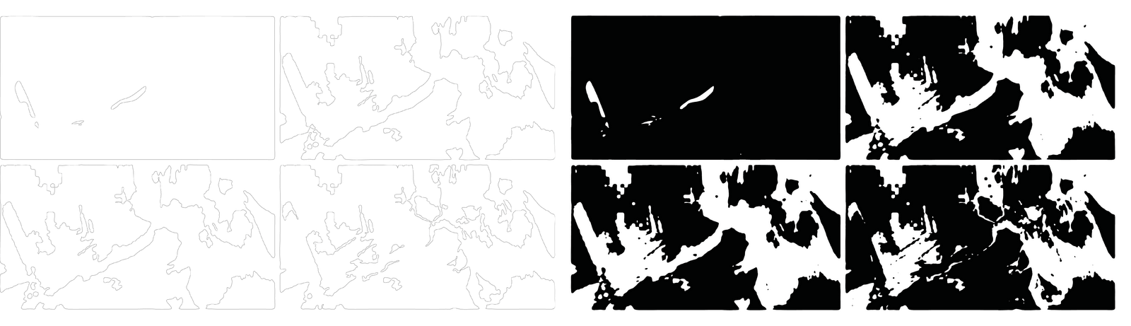
Since I could not find a successful way to draw my idea down, I decided to make a model of it. It was during the making process that I understood some of the details described in Design Process post and also made the decision as to how specifically to plan it. The model is still in the process of making, however it is at the stage when it begins to show what the space would look like.
Analysing my research I identified the main points that were interesting for me, also being the turning points that influenced what I looked at next:
psychology and space depiction
amodal perception
surreal spaces
All this lead me to an idea of making a film of a walk through South Bank, from my point of view looking at what I see. The video was filmed handheld and the camera pointed in the direction I looked. I tried to keep the architecture of the place in the frame as that was the main element of the site I was interested in.
Once I had the footage, I exported it as stills at one frame per second and mapped the position of the buildings within the frame. I realised how much the perspective, angles and positions change from one frame to another. While this is because the I held the camera in my hand while filming and obviously the video was shaky, I realised that when we walk this is what happens to our eyes - with every step they change position, viewpoint etc. Even though our brain balances what we see into a stable image, I would argue that what we second after second is just as out of balance as a handheld film.
I decided to try and replicate this idea and show how a plain building changes over time and space as we walk past it.
Based on the stills from my video, I created a series of drawings to test how to best apply it. During this process I got more and more confused and I realised how difficult it would be to depict this idea in a 2D environment.
One of my options would be to show the same building over and over again in a line, with changes to perspective and angle - however, as soon as I started drawing it I understood this was not what I was looking for. I was more interested in showing it as a single form changing in space.
I arranged the stills in line at equal distances that are relative to the overall size of the building in scale (I assessed the scale based on the foreground image in the frame). This was logical to me as it is the way we view films - the image is framed onto the screen in front of us. I then mapped the position of the building in each frame and drew the line along the bottom right edge of it.
Each part of the broken line represents a segment of the model and links the positions of the building in two stills. I then started building up a model based on that. I used the heights and widths as a starting point for each of the segments based on the dimensions in the front of the image. The end point is the size of the following frame for them to align. The following drawing is a quick simplified model, however it is not fully accurate and I need to draw another, more detailed one.
I started this project by exploring the link between depiction of space in film in response to protagonist's state of mind. I was interested in the subjective view of spaces as seen by the camera lens. I also looked at the ways we perceive spaces and objects. One interesting concept I came across, Gestalt psychology, explained how a fragmentary view of space is processed by our brains to be understood as a coherent whole. Therefore if we see a fragment of a building behind railing we will know it is one object rather that reading it as a series of elements as seen between the bars. Likewise, as we walk past places and objects, we perceive them as whole entities while in reality we only see fragments and, moreover, their position against us changes every step we take through the space and over time. This, as a space-time relationship brings us back to film where seeing a part of a location, we place it in context to understand it, we assume the continuation of this location off-screen. However, watching surrealist films, especially Un Chien Andalou by Luis Bunuel and Salvador Dali I noticed that just by blurring the edges of the screen into black, we isolate the space we see and it appears to exist in void, it does not extend off-screen. These notions eventually lead to an idea where I revert the process of turning fragmentary view into a coherent whole and break down a building I pass by into sections as ween by camera lens, frame by frame. I then, using a camera lens, fragment a coherent architectural entity into segments relative to its position in frame, second after second. This relates to Muybridge's photo experiments of horses in motion, however in this instance it is a person that is moving along a building that remains in its place. The proposed depiction of an architectural object becomes an installation showing a space normally perceived (however not actually seen) as a whole entity. It thus represents the changes in what we see as a building over space and time, as we move past it.
During my research I have come across Decasia: The State of Decay. A Film by Bill Morrison, showing images distorted by decay of nitrate film reels. It was interesting to see the how the physical damage of the film can change and distort the image, sometimes exaggerating the exposure and contrast, in other moments changing it beyond recognition.
Over the last couple of weeks I have been distracted with a small project that came to my mind. It's been the kind of idea that gets into your head and don't let you focus on anything else until you're finished with them. I thought it would take me about 3-5 days' work but technical problems kept getting in the way and I only finalized it today, on Easter Sunday. So, without further introduction, here it is, an Easter gift to myself:
Looking at the way we see and recognize images I came across an interesting text about the mechanisms of recognition. The paragraph comes from a book titled The Image and the Eye by E. H. Gombrich:
Recognition is easy, it is almost automatic, but, perhaps because of its automatic quality, largely unconscious. Not unconscious, to be sure, in the Freudian sense, but in the sense of those automatic processes to which we need not and often cannot attend. We do not know how and why we recognize a correctly drawn cow, but we soon notice if something is amiss in a real or pictured cow.
[...] the difficulties portrait painters so often experience. Troublesome relatives of their sitters will insist that there is still something around the mouth that is not right, that they still cannot quite recognize Uncle Jimmy. Yet they are rarely willing or able to say why the mouth looks wrong to them. [...] I tend to believe that the relatives probably knew what they were talking about. It is genuinely disturbing to feel an element of strangeness unsettling a familiar sight. We tend to notice at once if something in our room has been shifted, though few of us could ever recall, let alone draw, the content of our rooms.
While we all know this in a way, having it explained explicitly made me consciously aware of this pattern of recognition (or am I just rephrasing what Gombrich wrote and relating it to our learning and understanding?).
To relate it to a specific image/space, I felt a similar confusion a few year ago when I got pictures from my holiday in Iceland developed. I looked at one of the images and there was a problem with
it. The clouds were rightly on top of the image and it all seemed fine and yet the picture did not work. It took me a while of turning it around and looking at it from all points before I realized it was actually upside down! The clouds as seen above the landscape are actually a perfect reflection of sky in the water, deceitful enough to confuse me - and I was the one who took the picture.
Back to the topic, as soon as I saw the picture, I knew it was wrong and it took me relatively long to figure it out.
This must be then what the automatic recognition does - it makes you immediately aware of things even slightly out of sync and forces you to stop and look again. Interestingly, this way we get to see plenty of things we would have otherwise passed by. Therefore a good design (or film) might have an unexpected or slightly our of ordinary element to it to get the viewer to remember it.
Having done my basic research into ways of representing and perceiving spaces, I have started finalizing ideas for my project proposal. It will involve filming of locations/sets in a way that represents a particular mood/feeling/state of mind. Before I plan it in detail though, I have one last step to go through. I will analyze camera movement in relevant films in relation to plot to understand better what effect a particular shot gives and what it implies.
There are several aspects I want to look at and I will be uploading them over the next few days.
This video does not show the camera movement as much as set lighting and movement (quite literally) - the corridor was designed in a way that, depending on scene requirements, the width could be adjusted. On the left screen I showed 'objective' view of the interior, as seen by all characters, and on the right screen - as seen by Carol. The shots, arranged chronologically, show clearly how the protagonist's perception of the space changes throughout the film and at the same time it is very clear to the viewer that this is how she sees it. Additionally the scenes with other characters in them are, as shown, longer and the movement in them is slower, more composed and calm. Carol always seems to walk fast and make frantic movements (head, arms) which also builds up the rhythm and tension in the film.
In this clip I put together scenes shot at different angles - eye level and fairly low angle that can be compared to a child's eye level. This way of showing spaces and characters relates to Carol's passivity and vulnerability, as if she actually was a child and as such reflects her mental condition. In the first part we see the kitchen where Carol's sister and her lover enjoy a breakfast alone. Next to it is another kitchen shot, taken at a lower angle and thus signaling Carol's appearance. It also shows the relation between the sisters where the older one is clearly in charge. The following two parts of the clip show how in subsequent scenes the angle changes to reflect Carol's change between anticipation of a problem and the actual unwelcome situation. While she is expecting trouble, she moves frantically, trying to avert it unsuccessfully or possibly get prepared to face it. She remains active. As soon as she faces an unwelcome situation, she becomes passive and simply gives in to it. That is when the angle changes, again reflecting her submissive and vulnerable nature.
This video focuses on two quite literal aspects of visual representation of Carol's condition. Firstly, there are rotting potatoes and rabbit left out for days to decay and disintegrate. This very closely reflects the protagonist's own mental breakdown. Another visual motif reappearing throughout the film are the cracks appearing in the walls, ceiling, sidewalk, even the creases in the bed linen. Again, they relate to her conscience and clarity of vision falling apart.
Finally, there is a clear representation of characters' role and intentions in particular scenes through the angle they are filmed from. There are many moments when the camera is looking up towards someone, or down at them. All shots looking from below at someone/something, suggest the person's/space's oppressive role or character at that moment. At the same time, the camera looking down signals the person in view is a victim. Interestingly, even though the viewer tends to sympathize with Carol, the is shown as both the villain/oppressor and the victim here.
A little while ago I started analysing Repulsion in a form of map/diagram. I wanted to look at different elements of the film such as shot length, shot types, light/darkness opposition in relation to plot turns and tension. I started with the first map showing the shot duration when I it was pointed to me that I needed to analyse information in a visual manner rather than focusing on data. While I fully agree with it, I still think the exercise I began is useful for gaining a deeper understanding of film grammar and the relation between different elements of it and I may come back to it later in my own time.
Looking at Polanski's inspirations I came across Bunuel's 1929 film Un Chien Andalou made in collaboration with Salvador Dali.
Apart from it being a representation of surreal vision of the world, it also provides an interesting way of showing spaces. By blurring and blacking out the edges of the film we start seeing the scenes as detached from the areas out of the screen. When watching a film, we normally assume a spatial continuation to what we see on screen. We are aware that the area of a room, house, outdoor location as shown is only a part of a whole of it and place it in context of. However, with the edges of the screen blacked out the area in view becomes detached from its surrounding and exists on its own, with no relation to what might be around it. That interestingly flattens the surfaces and also focuses our vision and attention on what/who we see. By not expecting a continuation of spaces out of screen, we take what we see as is without distraction of assumed/imagined space.
The surreal scenes such as slashing the eye in line with a cloud passing over the moon, ants coming out of a gash in the hand and detached hand in the middle of a street bring to mind some scenes in Repulsion. There are rotten potatoes and rabbit in Polanski's film that similarly portrait decay. Another iconic scene is when the hands are coming out of the wall in Carol's apartment, reminding a similar scene in Cocteau's La Belle et la Bete (Beauty and the Beast, 1946).
I have taken stills from the house scenes of Repulsion and removed colour, replaced it with black and inverted to see what happens to spaces shown. Some of the images resemble drawings more than pictures now. Also, I got a lot on non-space areas, either plain black or white, that look like a flat surface more than the three dimensional interiors. This brings me back to Mammals, Polanski's short that I quoted before and reminds of how deceitful the perception of space in moving image can be. The only reason I was able to read the spatial context of the stills once the light was removed was because I knew that the spaces were having seen Repulsion. I therefore aligned both adjusted films I made of the stills with the original footage (cut to match the stills' content) so I can compare them while watching rather than analyze on their own.
Another way of manipulating the mood in film I have seen recently is subtle manipulation of tint of picture. As seen in About a Girl by Brian Percival (2001), the image is gradually turning colder throughout the film. By applying blue colour the whole aura of the film is becoming pessimistic and, quite literally, cold. The method is very subtle, I only really noticed it at the very end when the film returned to the full colour for the last scene.
Recently I have seen a very interesting piece of art by Sam Burford based on Star Wars. It was a sculpture based on the timeline of the film.
The artist has been working with film for several years now, mainly creating 2D graphics and pictures based on movies, but also sculptures as the most recent one seen above. Some of his other works include timelapse photographs that, similar to the sculptures, represent the whole of the movie and resemble slit scans, storyboards, or even strips of film with drawings on them.
In a way this shows the whole of the film in one piece of work that you can see at a glance, and none of it at the same time. The original spaces and situations from the movie are illegible and yet it makes sense as a whole, creating new visual data and reflecting more of an atmospheric feel, ambience than the content.
One of the areas I was looking at in Repulsion is how light, or lack thereof, affects the way we understand spaces in the film. My first impression was just that they seemed smaller, more claustrophobic and almost oppressive to reflect protagonist's condition. However at a closer look I realized that it's not only our understanding of scale that changes with specific lighting. I made a series of tests based on the film stills where I manipulated the colour and I noticed that the surfaces also change appearance and look more ambiguous. It is no longer clear where the corners are or whether some elements are parts of furniture, floors etc.
The book I have been reading recently, House of Leaves, shows a different concept of space changing in response to what a character is seeing/expecting. It refers to dark corridors and staircases that expand and contract in response to characters' fears and anxieties about it.
Some critics believe the house's mutations reflect the psychology of anyone who enters it. Dr Haugeland asserts that extraordinary absence of sensory information forces the individual to manufacture his or her own data.(...) the house, the halls, and the rooms all become the self - collapsing, expanding, tilting, closing, but always in perfect relation to the mental state of the individual.
Experienced or concrete space: It has a center which is perceiving man, and it therefore has an excellent system of directions which changes with the movement of the human body.; it is limited and in no sense neutral, in other words it is finite, heterogeneous, subjectively defined and perceived; distances and directions are fixed relative to man...
Both here and in Repulsion we deal with space that changes when seen by different people, or even the same people in a different state of mind. There is a few differences such as the scale of changes to spaces and whether it is space that is haunted or a person, but at certain level both come down to how the space is perceived.
Recently I have seen Anthony McCall exhibition. Four of his light films were projected in a dark space. The light cut through darkness of the exhibition hall marking lines on the floor and moving slowly. What was the show's main strength was its simplicity, all the elements including the interior space were minimal and this only highlighted the projected films and forced the viewer to focus on them and follow the movement of the lines.
The darkness filling the room also forced one to focus on works in a more direct way - not only the works stood out but also were the only point of reference for the viewer. Coming from bright spaces into a dark area as such, it took me about 10-15 minutes to fully adjust and be able to see anything other than the projections. This may be linked also to films' duration - they are all about 15 minutes long.


